
The Power of Successful Branding
![]()
Branding is one of the most important elements of any business. It's a way of 'distinguishing a product, service, institution or event from its almost identical competitors'.
Developing a successful brand does not happen overnight; it requires building a strong brand identity over time that in turn influences awareness and customer loyalty. A company that invests in crafting a professional brand identity is giving its employees the greatest tool to construct team pride internally and to connect with its target market.
The strongest brands have a deep understanding of the demographics of their target customer, including their interests and the best methods to communicate with them. This provides direction for the tone and reach of their marketing, along with the overall identity of the brand, which creates an organic connection between the business and target market.
If a brand's logo is designed effectively, it can serve as a source indicator to consumers, allowing them to make a quick judgement about the quality they can expect from that company's goods and services. When popular businesses change their branding or logos it can be surprising; considering that building a strong identifiable brand is a big investment that takes time and money.
According to John Anstey from the University of Canberra's Faculty of Arts & Design, brands may decide to revamp because "logos and typefaces can date".
Smart companies stay aware of changes in design tastes and change their logo by small degrees every couple of years.
"Other slightly obscure but common reasons are that the management committee is bored with the old one, or the company has a new Marketing Director or CEO who doesn't really like it."
Changing a business's branding can have either a positive or negative effect. Building a relationship with the consumers can create an attachment to a particular logo or image of the brand. Changes can make it unfamiliar, trust can be lost and it can be fatal to the business. This was the case for Tropicana Orange Juice, an American juice company who changed their packaging in 2009 only to receive a 20% drop in sales. Consumers felt a deep connection and bond with the original packaging and were unfamiliar with the new design, turning to its competitors instead.
It's important however to keep in mind that the same power can often work in a positive direction.
Many brands have evolved their logos over the years, making small minor changes. Google has made 6 changes to their logo since 1997, Pepsi a surprising 10 changes since 1898 and Microsoft a total of 4 changes since 1995.
Some brands like Netflix have simply changed due to the evolution of social media and society. Making adjustments like dropping the 'etflix' to fit social media platforms such as the Apple App store, Facebook and Instagram.
In the end branding is more than just the product, name, logo, design and tagline. A brand is the sum total of every interaction and experience a customer has with the product. It's that difference that sets a business apart and is what makes companies leaders in their respective industries.
Top 3 Best Branding Changes
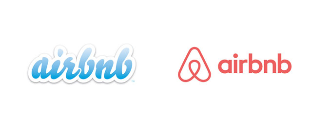
Airbnb
Using renowned creative agency DesignStudio, the company took their time on the logo; an abstraction of four principles – people, places, love and Airbnb blended together into a single 'A' shape. The launch created a global conversation; signalling a maturity in the branding and giving it a modern, memorable and identifiable logo that has the power to last for many more years.
Microsoft
2012 saw Microsoft make one of its biggest movies with the introduction of a new logo, redesigning themselves to fit in with the 21st century and stay present amongst their competitors. The change of font and introduction of colour had a positive effect and saw them regain their leading status.
![]()
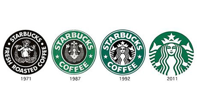
Starbucks
Starbucks continuously refresh their logos and packaging without losing their core image. The re-brand of 2011 was subtle and executed in a way that didn't draw attention immediately. Removing the outer green ring, star icons and text, the logo was left with the single 'siren' lady figure in their iconic green colour – giving it a sleek and modern look.
Top 3 Worst Branding Changes
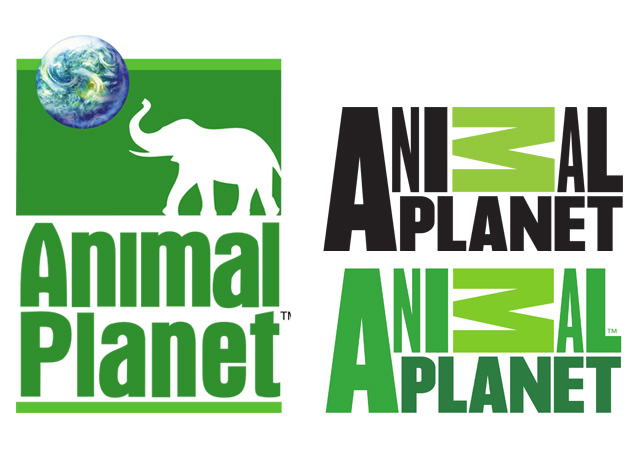
Animal Planet
The original Animal Planet logo launched in 1996 and became a well-known and respected icon. A new logo was created in February 2008 by Dunning Eley Jones. It received mostly negative feedback and is regarded as one of the worst-received logo re-designs.
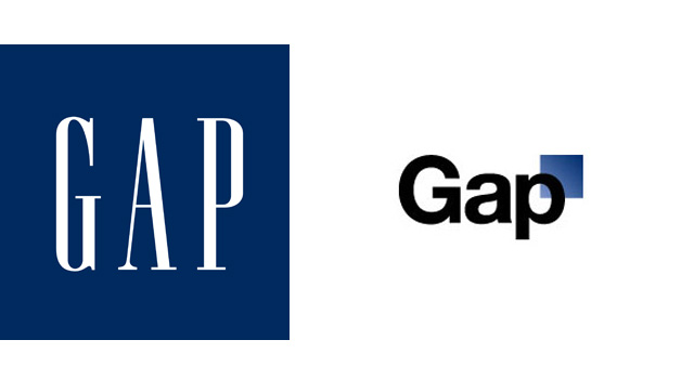
GAP
GAP learned the hard way when they changed their 20 year old logo overnight. After receiving copious amounts of criticism the brand reverted back to their original logo after just 6 days. The re-brand estimated to have cost them around $100 million.
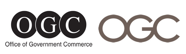
OGC (Office of Government Commerce)
Costing almost $30,000 to create, the updated logo was designed to connote a bold commitment to the businesses misson of improving value for money. Instead the OGC logo caused embarrassment when it was discovered that turning it 90 degree clockwise gave it a sexual connotation.
Words by Stephanie Cossetto, images courtesy of pixabay.com